
Developer's Diary #2:
The Book Cover art design
I'm still trying to track down the first sketches of the Nowhere Wolf. I think the original sketchbook is still in England so I still can't do what I had first hoped and show you how the Nowhere Wolf and the other characters developed over time. But here's an insight to how the first full-colour Nowhere Wolf came about. It's on the cover of the book.
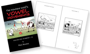
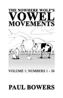
The cover for the Nowhere Wolf's Vowel Movements book was a real dilemma. I couldn't use colour inside the book, but the cover was fair game for a spot of CMYK magic. The cartoon was developed for newspaper inclusion and so I'd never considered using colour or even how I'd render it if I had the chance. But I sure didn't want a black and white cover for the book -- I wanted something colourful and eyecatching without losing the feel and character of the monochrome cartoons.
The whole process was done in Adobe PhotoShop after importing one of the cartoon panels from Macromedia Freehand. There was little text - PhotoShop can handle text only in small doses -and I wanted as much control over the image as possible. This was the first draft ... really little more than just slapping down the elements, but it became even more obvious (if that's possible) that it needed colour. And the text needed a whole lot of work.


Ok, so that wasn't the solution. It was colourful ... but lame. Maybe a strange thing to say about a very two dimensional cartoon, but this image was soooo flat. What next? I wracked my brain for things I'd seen recently which I'd been inspired by. I'd been watching a lot of Adult Swim on the Cartoon Network and noticed a lot of the superimposing-drawn-cartoons-over-photo-backdrop thang going on. I thought it could extend the style of the Nowhere Wolf to where it should be if it were ever produced in colour. It's a really nice effect when done well. I thought I'd give it try. I gathered some photos... a sky ... a hill ... some grass ... ok ... now all I had to do was montage it all together. Thanks, PhotoShop.
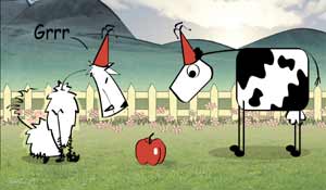

I couldn't resist the lens flare. I try to avoid them, but sometimes it just makes such a nice effect (Ok, I lied ... I'm still in denial about lens flares ... I know I shouldn't use them, but I can't resist. I'm a bad monkey). As it happens, it added depth to the image - something which was much needed as I was still resolute about not rendering either of the characters.

The last thing I did was to tie the text and image together by using the same red. And then it was done. Result.
Total time taken ... about 4 hours.
posted by Paris at 1:39 PM
![]()
![]()


0 Comments:
Post a Comment
<< Home